
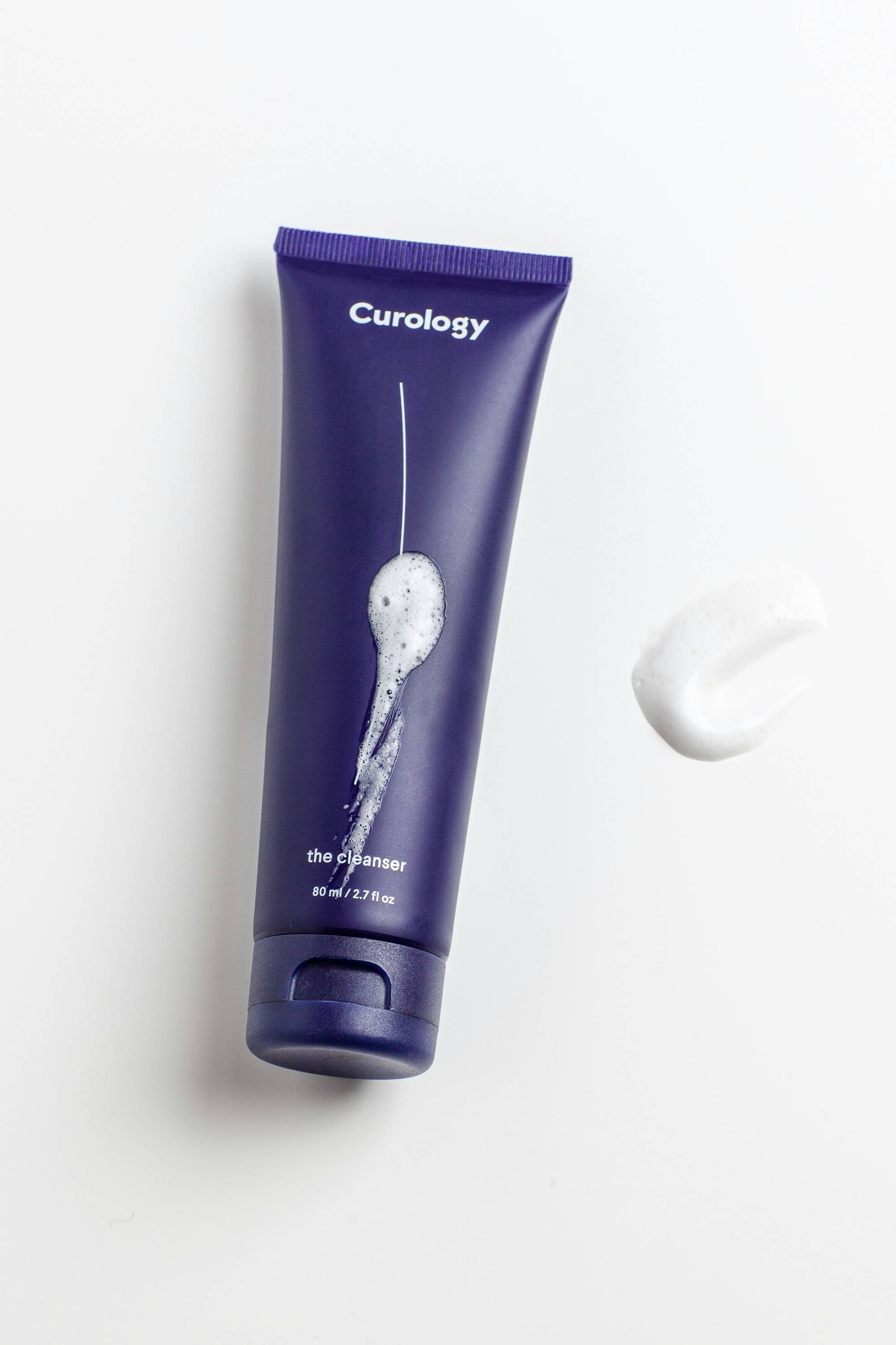
Quick-Turnaround Packaging for a Sister Brand Launch
How Knockout used a shared structural design across 12 SKUs to help Pink Moon launch 'Once in a Pink Moon' quickly, then extend the partnership to new products.
- Client
- Pink Moon
- Industry
- Clean skincare
- Packaging Type
- Custom retail cartons (secondary packaging)
- Key Requirements
- A fast turnaround for a new sister-brand launch across 12 SKUs
- Manufacturing Region
- North America
- Outcome
- An efficient multi-SKU launch, followed by an ongoing packaging partnership
Pink Moon
Pink Moon is a compassion-first, women-owned brand with products that celebrate individuality, authenticity, inclusivity, and unapologetic self-love. Founder Lin Chen is a social entrepreneur and member of the AAPI community who set out to help reshape the beauty and wellness industry.
Beyond skincare, Pink Moon donates 1% of revenue to charity partners as part of its broader brand mission.
Learn more about Pink Moon → A New Sister Brand, Launching Fast
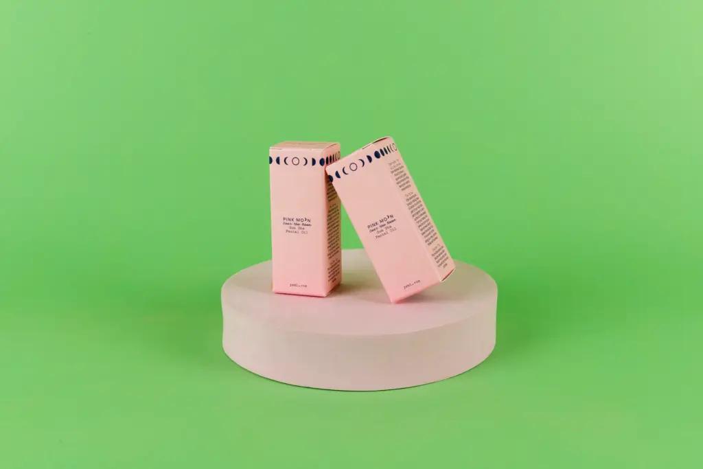
The team at Pink Moon was getting ready to launch their sister brand 'Once in a Pink Moon' and needed high-quality, sustainable packaging with a quick turnaround. Knockout developed sustainable secondary packaging across the sister brand's 12 SKUs, an engagement that has since grown into an ongoing partnership, including packaging for Pink Moon's Gua Sha Facial Oil.
- A quick-turnaround launch for a brand-new sister brand
- Consistent packaging across 12 different SKUs
- Sustainable materials without slowing down the launch timeline
- A packaging partner able to support future product lines
One Structural Design, Many SKUs
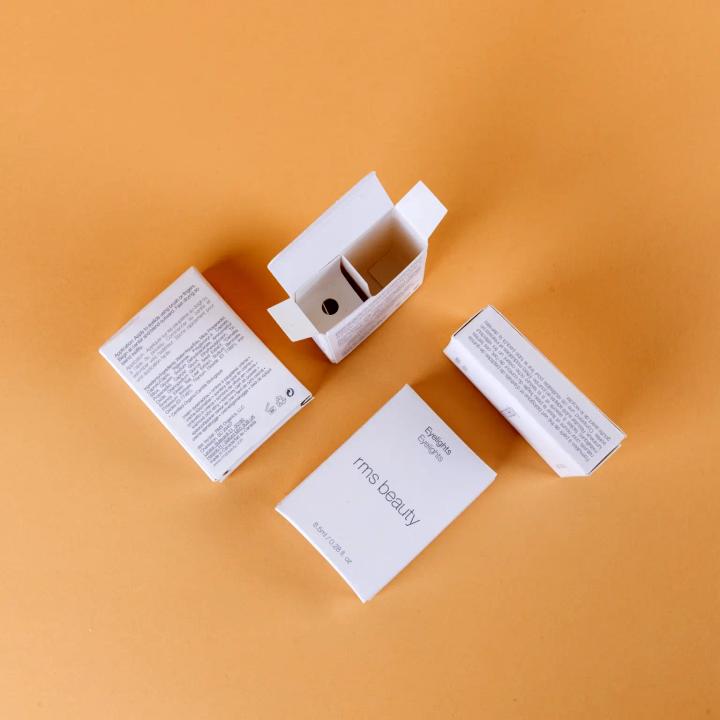
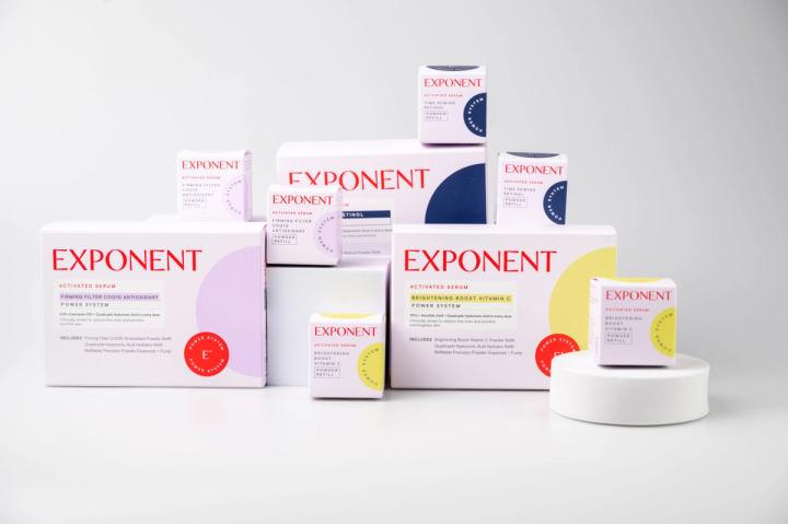
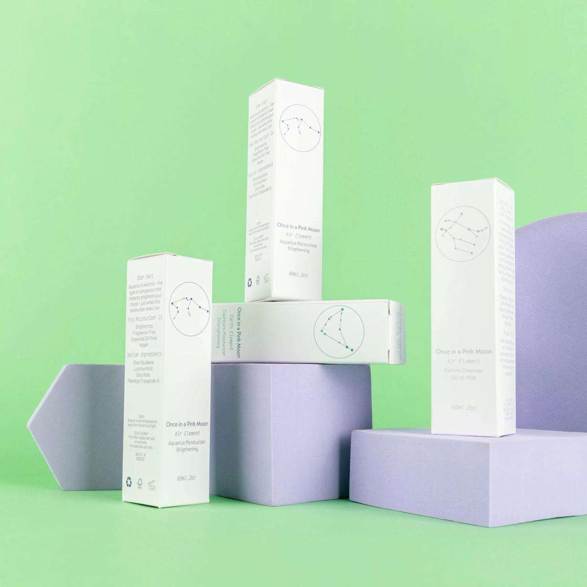
Knockout used the Pantone Matching System to achieve stunning hues that matched each product inside, while keeping the same structural design across many printed versions to create cost savings on the launch. This let Pink Moon move quickly across 12 SKUs without sacrificing color accuracy or brand consistency.
- Pantone Matching System for accurate, consistent color
- A single structural design reused across multiple print versions
- Cost savings achieved through design efficiency, not shortcuts
- A production process built for launch-speed timelines
Elevated Branding, Launch After Launch
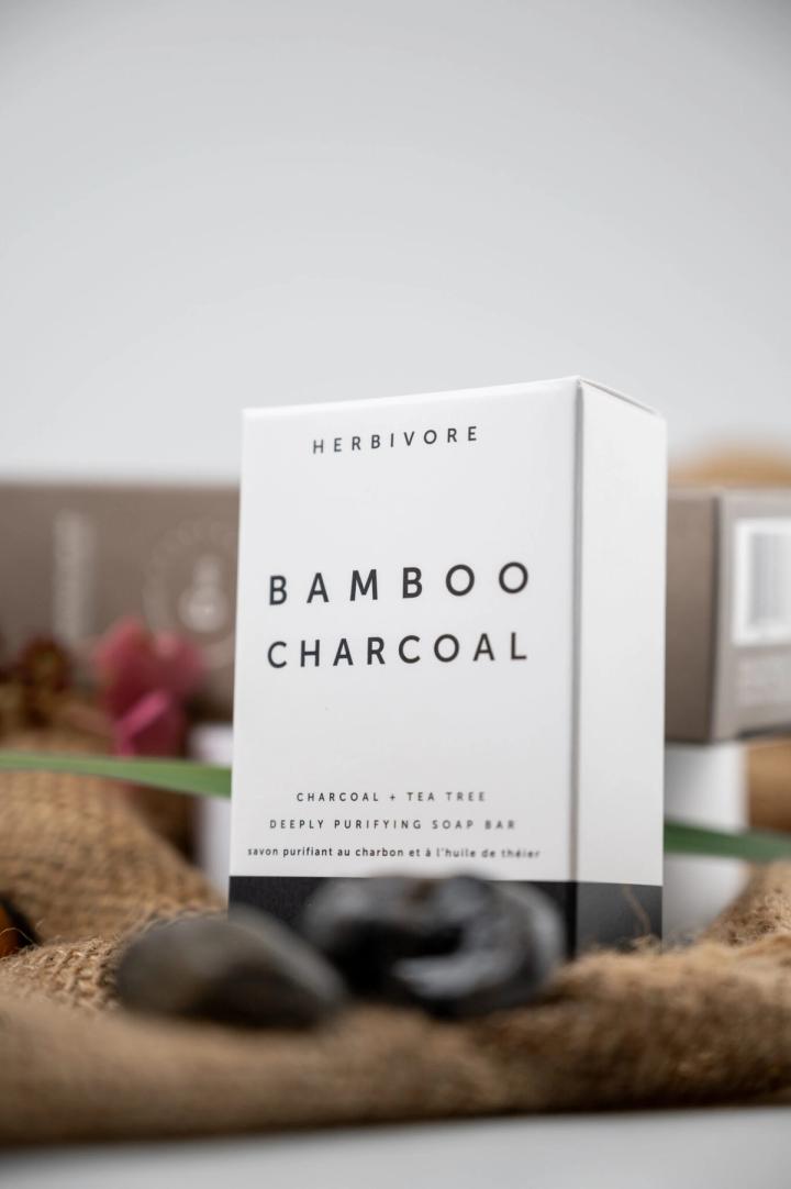
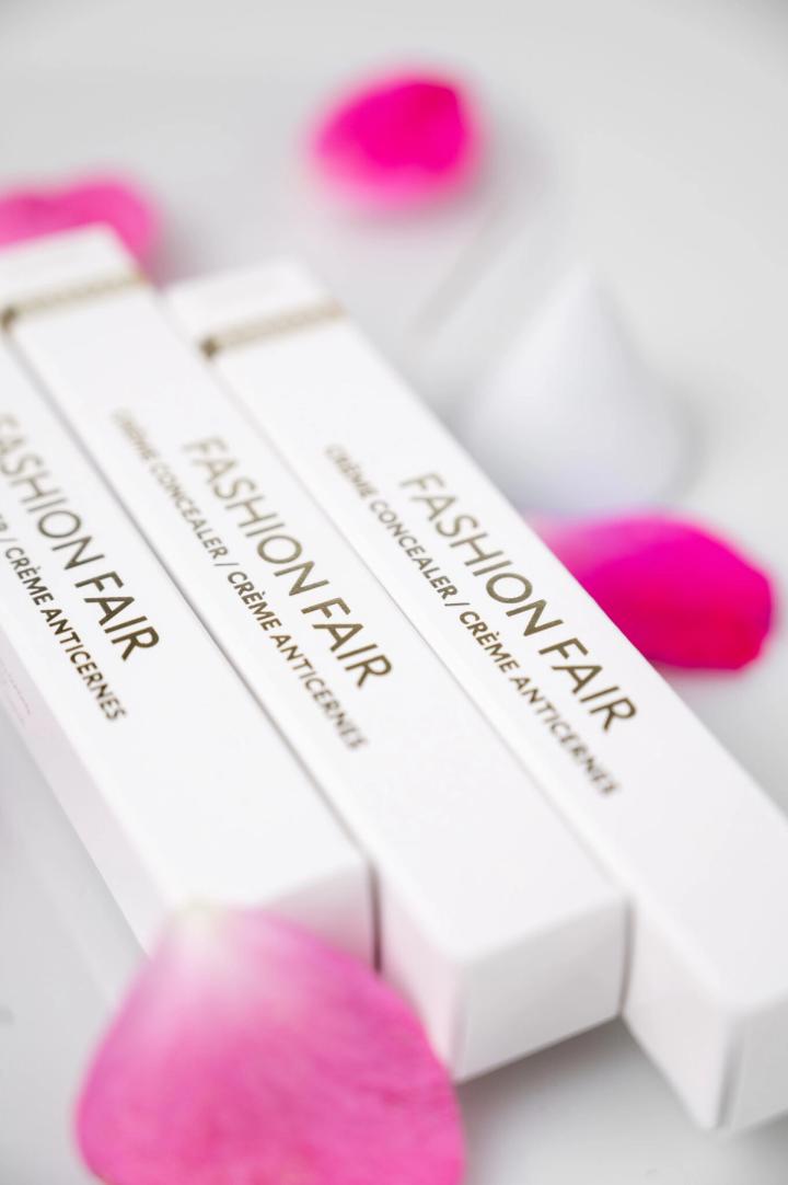
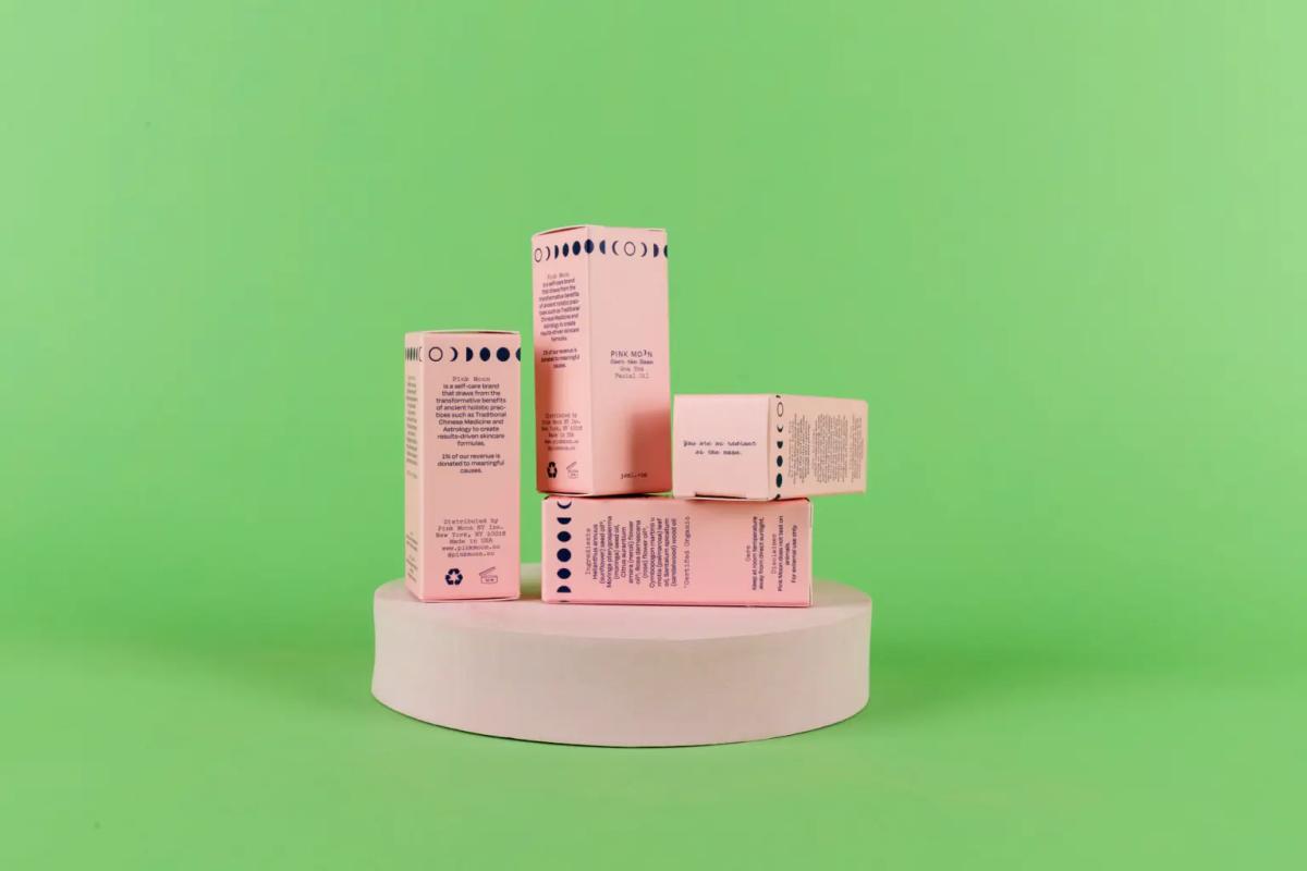
Clean, minimal graphic design paired with a balanced white paper shade created stunning packaging for the Pink Moon launch. Elevated branding was achieved for both the original sister-brand launch and Pink Moon's ongoing product expansion, including their Gua Sha Facial Oil.
- Elevated, minimal packaging design across the collection
- Consistent color accuracy through Pantone matching
- Cost savings from a reused structural design
- An ongoing packaging partnership beyond the initial launch
Common questions about this project
Why use the Pantone Matching System for cosmetic packaging? +
The Pantone Matching System uses standardized, pre-mixed color references so a brand's exact shade can be reproduced consistently across different print runs and packaging formats.
How can a brand launch multiple SKUs while controlling packaging costs? +
Using the same structural carton design across multiple SKUs, with only the print graphics changing, reduces the die and setup costs of introducing several products at once.
What should a brand consider when launching a sister brand? +
A sister brand often needs its own distinct look while still being produced efficiently, which can mean reusing proven structural designs while updating graphics and color for the new identity.
Why do skincare brands need quick-turnaround packaging for new launches? +
Product launch timelines are often tight, so having a packaging partner who can move quickly from design approval to finished cartons helps a brand hit its launch date.
How does packaging support a clean beauty brand's positioning? +
Minimal graphic design paired with balanced paper tones can reinforce a clean beauty brand's message, letting the product itself remain the visual focus rather than heavy packaging graphics.